
Curiosity Labs at Ernst & Young
Type: UX Design Workshop
Role: UX Design Lab Participant
The Project Prompt
The focus of Curiosity Labs was to design a mobile coffee-ordering app for current Ernst & Young (EY) employees. Curiosity Labs Design Workshop is a 5-week UX Design course offered every six months at EY. It caters to individuals interested in expanding their knowledge of UX design and research while providing networking opportunities with the Digital and Emerging Technologies practice.
Design and prototype a mobile coffee ordering app for current EY employees
Conduct 2 User Interviews
Create Low Fidelity Wireframes using Figma
Create High Fidelity Wireframes and Prototypes using the EY Design System
Conduct 2 usability studies
Iterate on design/prototype
User Interviews
To better understand our potential user base and their preferences, our initial task involved conducting user interviews with 2 to 3 current EY employees. In my case, I interviewed 2 employees from the Assurance Service Line. After conducting the interviews, design lab participants were organized into breakout groups and utilized affinity diagrams to document our findings. This process enabled us to identify user needs, pain points, and common behaviors that emerged from the interviews.
User Interviews Takeaways
Users want to have customization options, without sacrificing time and having images that are representative of what they are ordering.
Options to reorder the same coffee via an order history or reorder function.
Item categories to distinguish different items on the menu.
Map of physical location/desk area.

Low-Fidelity Wireframes

Low-Fidelity Challenges
The setup of the checkout screen layout was not familiar to users in comparison to other mobile coffee apps
Creating a simplified order screen that is different but familiar to users
Resolutions
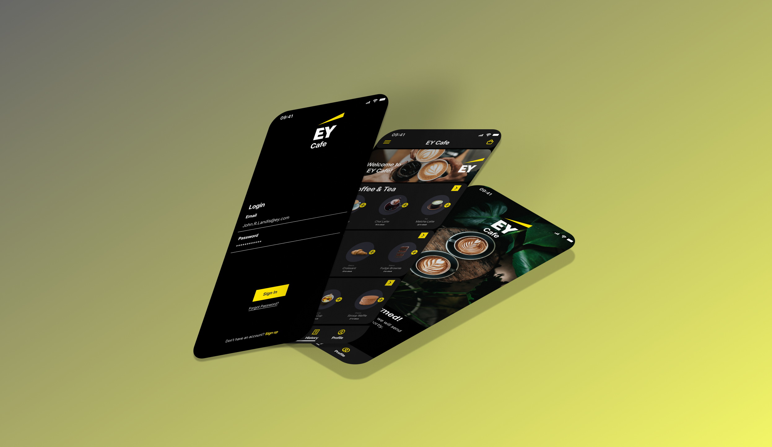
In the initial iteration of the high-fidelity wireframes for the checkout screen, I made changes to the orientation of how information is presented to users. Considering that the EY Cafe App is free for EY employees, I placed greater emphasis on the location and provided comprehensive details of the user's order.
To enhance the user experience on the order screen, I aimed to minimize scrolling for customization purposes. During competitive research and discussions with peers, I discovered that continuous scrolling was a common frustration with the Starbucks Mobile App when users customized their orders. To address this issue, I designed the EY Cafe App with all the necessary dropdown menus conveniently placed on a single page. This approach reduces user frustration while still allowing for extensive customization and user autonomy.
High-Fidelity Wireframes - First Iteration

Usability Study 1
After completing my first iteration and prototype of the EY Cafe App, I conducted two usability studies with the same EY employees I had previously interviewed. After conducting the interview I identified the roses, thorns, and buds of my current iteration.
Roses:
Easy to understand user flow.
High Level of Customization.
The app experience is familiar to users.
Thorns:
The menu item presentation was confusing. Users seemed unsure if the options all came from the same vendor.
Users struggled to hit the correct button for their drink size.
Buds:
Users wanted to have a dropdown for their location that was similar to the item customization.
Users wanted to set their location earlier in the process instead of at the end of the flow.
After identifying the roses, thorns, and buds of the app, I proceeded to iterate on the design, prioritizing specific areas for improvement. In particular, I focused on enhancing the presentation of menu items, addressing issues with size options for drinks, and ensuring a consistent brand experience throughout the app. These improvements aimed to enhance the overall user experience and maintain a cohesive and recognizable brand identity.
High Fidelity Wireframes/Prototype - Second Iteration

Key Changes Made
After the first iteration, I implemented a few changes to improve the overall user experience and focus on the consistency/presentation of the application.
One significant change I implemented was removing the backgrounds of all menu items and ensuring consistent background colors and presentation across different categories. This adjustment not only improved the user experience but also contributed to maintaining a cohesive brand identity throughout the app.
To address user frustration when selecting drink sizes, I improved the functionality by adding interactivity to the hollow circles alongside the S, M, and L labels. Previously, users would repeatedly click the hollow circle without any response, leading to frustration. This update allows users to click on the circle itself, providing a more intuitive and user-friendly experience when selecting their desired drink size.
To improve the functionality and address user confusion on the checkout page, I rearranged the order of details and added functionality to the room/space selection dropdown. These changes aim to provide a more intuitive and seamless checkout experience based on user observations.
Usability Study 2
Recognizing the need for additional input to further enhance the customer experience, I proactively sought feedback from a Senior Manager in UX at EY. Their valuable insights provided me with significant guidance. Taking their recommendations into account, I incorporated some of the suggested changes into the final version of my prototype, which would be shared with all participants of the Curiosity Lab. These modifications aimed to deliver an improved and impactful user experience.
Takeaways from my meeting with a Senior Manager in UX:
Adding a login page will help the overall flow of my design and create a complete user experience.
Allow the users to set their location at the beginning of the process rather than at the middle/end of it.
Reduce the amount of yellow throughout. The use of yellow should be consistent and be primarily used for the main actions users will perform.
At the checkout page, the edit item function should be a separate color from the main action you want users to perform.
When adding an item to your cart/bag, the wording should be consistent with the cart/bag icon.
Adding a progress tracker for a user’s order would be beneficial to have and keep users up to date with the order progress.
High Fidelity Wireframes/Prototype - Third Iteration


Moving Forward
Upon completing the course, I was chosen as one of the select few Curiosity Labs Participants to join the monthly UX meetings for the Digital and Emerging Technologies service line. This opportunity allows me to network and be considered for a potential transfer from Assurance to a UX Designer role within the Digital and Emerging Technologies practice. As I join these calls, I will actively engage with current EY employees to stay connected with the practice, with the ultimate goal of transitioning into a full-time UX Designer position on the team. The five-week course was an incredibly valuable experience that significantly expanded my overall knowledge of UX and I am eager to stay involved.